Plantation shutters are timeless, versatile, and stylish—but the right shutter colors can take them from simply functional to a defining feature of your home’s design. Whether you want a crisp, classic look or a bold, contemporary statement, color choice plays a huge role in how your shutters enhance your space. Popular colors range from soft neutrals to rich, dramatic tones, and the “best” option often depends on your home’s architecture, wall colors, and natural light.
In this guide, we’ll explore the most common questions homeowners ask when choosing plantation shutter colors—from the most popular options to how they pair with white exteriors or specific wall shades. By the end, you’ll have a clearer idea of how to choose a hue that feels perfectly at home in your space.
Let’s take a closer look at the details that make your color choice both beautiful and practical.
What are the most popular shutter colors?
While plantation shutters can be customized in a wide range of finishes, some colors consistently rise to the top for their timeless appeal and versatility:
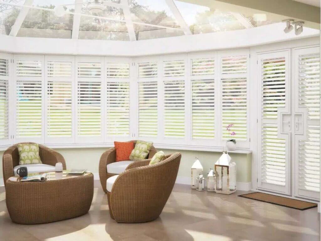
- White and Off-White – Bright white shutters bring a clean, fresh look that suits almost any interior style. Off-white tones, like ivory or cream, offer a softer warmth that works well in traditional and transitional spaces.
- Soft Neutrals – Shades like light gray, beige, and taupe provide subtle elegance without overpowering your décor. These colors also hide dust better than pure white.
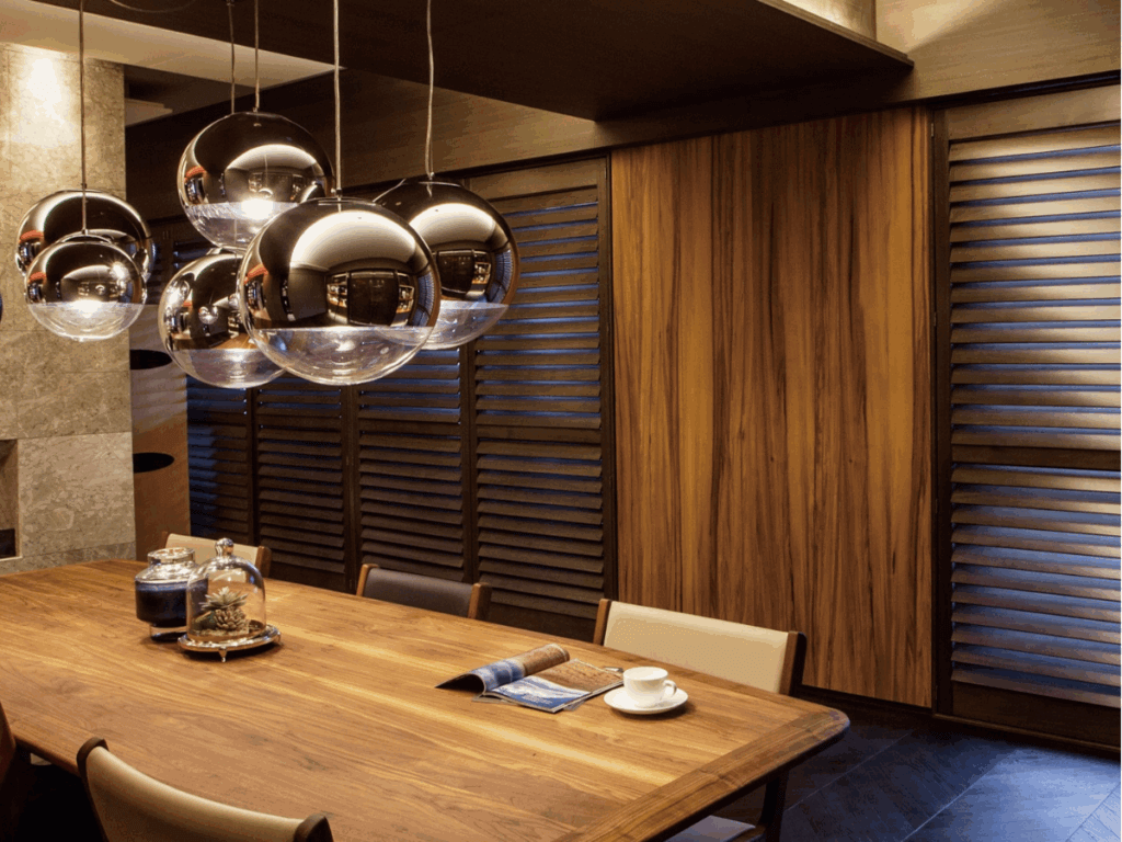
- Natural Wood Stains – From honey oak to deep walnut, wood finishes showcase the shutter’s grain and add organic warmth.
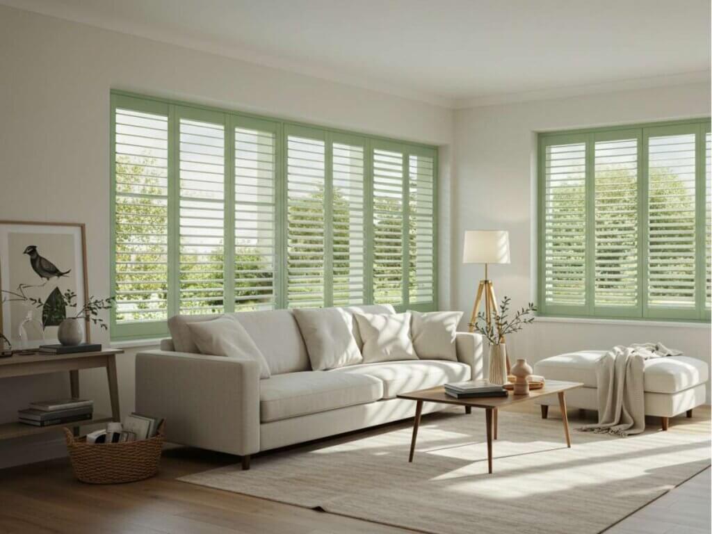
- Bold Accent Colors – While less common, deep navy, forest green, or charcoal can create striking focal points, especially in modern or coastal homes.
These popular shutter colors endure because they’re adaptable—making them a safe choice if you want longevity and flexibility in your design.

How do I choose the right shutter color for my house?
Choosing the right shutter colors involves balancing aesthetics, architecture, and functionality. Here’s what to consider:
- Match Your Style – If your home’s interior leans traditional, creamy neutrals or rich wood tones may feel more at home. For contemporary spaces, clean whites and cool grays often work best.
- Think About Longevity – Neutral shades tend to have staying power, so you won’t feel pressured to change them if you update your décor.
- Assess Your Lighting – Natural light can make colors appear brighter, while low-light rooms may benefit from warmer tones.
- Coordinate With Trim – Shutters that match your baseboards, crown molding, or window trim can create a cohesive look.
Ultimately, the right color should complement—not compete with—your home’s existing features.
Should shutters be lighter or darker?
There’s no one-size-fits-all answer, but here are a few guidelines:
- Lighter Shutters – Make a room feel airy and open, and they pair well with most décor styles. They also tend to show dust more quickly, so be prepared for occasional upkeep.
- Darker Shutters – Add richness and sophistication, especially in large rooms or spaces with abundant natural light. They can anchor the design and make windows a focal point.
- Mix and Match – In some cases, a darker stain for wood shutters in living areas and lighter tones in bedrooms can create variety while keeping the overall style cohesive.
The choice often depends on your desired atmosphere—light colors for openness, dark for drama.
How do I choose a shutter color that works with my wall color?
Coordinating your plantation shutters with your interior wall colors ensures a seamless look:
- For Light Walls – White shutters blend in for a clean, streamlined appearance, while darker colors add dimension.
- For Dark Walls – Crisp white shutters can brighten the room, while rich, similar-toned shutters offer a dramatic, cohesive effect.
- For Colorful Walls – Consider neutral shutters that balance the intensity of the wall color without clashing.
- Sample First – Place color swatches against your wall during different times of day to see how lighting affects the look.
Choosing the right shutter colors for your walls often comes down to whether you want the shutters to stand out as a design feature or blend harmoniously with the background.
What shutter colors look good with a white house?
A white house offers incredible flexibility when it comes to shutter color choices. Here are a few standout combinations:
- Classic Black – Creates sharp, timeless contrast.
- Navy Blue – Offers sophistication without feeling too stark.
- Deep Green – Pairs beautifully with natural landscaping.
- Warm Wood Tones – Add texture and depth to a crisp façade.
- Soft Pastels – Light blue or pale gray can bring a subtle, coastal charm.
With a white house, you have the freedom to choose high-contrast colors for bold appeal or softer tones for a more understated finish.
Bringing Your Shutter Color Vision to Life
Choosing the right shutter colors is about more than matching paint chips—it’s about creating a look that reflects your style, works with your home’s features, and stands the test of time. Whether you prefer crisp whites, warm wood tones, or bold statement shades, the right choice will make your plantation shutters a lasting design investment.
Ready to see how the perfect shutter color can transform your home?
Made in the Shade St. Louis offers a wide selection of customizable plantation shutters and expert guidance to help you find the ideal color for your space. Contact us today to schedule your free in-home consultation and explore the possibilities.